In this article, we introduce the Gauss+ model for the yield curve. The model belongs to a wider class of models called Affine Term Structure Models (ATSMs) which serve the purpose of modelling the short rate for the pricing of risk-free term structures. These models typically link the short rate to a set of factors, either latent (as in the case of Gauss+) or observed. We explain the intuition behind the model, implement a calibration scheme, and discuss the results on empirical data from three term structures of government bonds, particularly those of U.S. Treasuries, U.K. Gilts and German Bunds. The model’s residuals are tested as a relative value indicator to trade the entire yield curve relative to two benchmarks that are chosen as exactly priced.
A brief introduction to yield curve modelling: why model the short rate?
Yield curves are high-dimensional objects. There is in principle a different yield for every maturity, and these move together in complex, correlated ways. Before introducing any type of model, the natural starting point is the short rate  , the instantaneous risk-free rate corresponding in practice to the overnight policy rate set by the central bank. Under no-arbitrage, the price of a risk-free zero-coupon bond maturing at T is:

Why is this the case? In asset pricing language, the discounted price process is a martingale under  , and since
  , the above follows. More intuitively, if we put 1 unit of cash in the money market account paying the short rate continuously, we get
  units of cash at time
  . If we want to answer the question “how many units of cash do I need to deposit now to get one unit of cash at time ?” then we need to have an expectation for what the value of the compounding factor will be between
  and . Hence the formula above.
This equation contains everything. The entire term structure of risk-free rates is determined by the expectation of the short rate’s future path under the risk-neutral measure . Modelling is therefore sufficient, since it is the object from which the full curve can be recovered. The practical challenge is choosing the model’s specification. The class of affine term structure models (ATSMs) solves this exactly. In ATSMs, is modelled as an affine function of a vector of latent state variables  . Those latent state variables are then assumed to follow a diffusive process of the form:

Where the drift coefficients  and
and  are assumed to be affine in . If the short rate can be written as an affine function of , then as Dai and Singleton (2000) have shown, bond prices can be written as exponentially affine to :

where  and
and  are deterministic functions of maturity. Equivalently, yields are determined by:

A particular choice of and is that of Ornstein-Uhlenbeck models, where:

Gauss+ is a three-factor Gaussian affine model with state vector  : a short factor identified with the current policy rate, a medium factor capturing near-term rate expectations, and a long factor reflecting long-run equilibrium beliefs. The short-term rate is specified as a cascade of three latent factors:


where  and
and  are two independent standard Brownian Motions defined under the risk neutral measure . The cascade structure implies that: the short-term rate mean-reverts to the medium-term factor
  , which in turn mean-reverts toward the long factor
  , which mean-reverts toward the long-run nominal equilibrium
  . The stronger the mean reversion speeds
  , the quicker the pull of each factor to its anchor. The correlation parameter
  between the two Brownian motions captures the empirical co-movement between medium and long-run shocks to the two factors. Note that, with the model as it is described above, only and carry diffusion terms. In other, more advanced versions of this model, each factor carries its own diffusion term, including the short rate.
By no-arbitrage, these dynamics fully determine the price of every bond in the economy, and therefore every yield at every maturity. The zero-coupon yield at time for a bond with maturity  is:
is:

where  . The vector
  contains the factor loadings, deterministic functions of maturity that describe how sensitively each yield responds to each factor. They take the form
  , tend to one as
  and decay to zero as maturity grows, at a rate governed by the corresponding
  . The term
  is positive for any and it is a convexity correction that pushes yields below pure expectations. The factor loadings give the model its economic interpretability. At short maturities
  dominates, at intermediate maturities
  dominates and so on.
We do not report the full derivation of this result, nor the formulas for compactness, and we address these in the appendix uploaded online.
Building intuition on the parameters
In order to build more intuition on how each parameter shapes the term structure, we will now see how both the spot and 1-year forward curves change when we stress the various parameters and factors. First, we consider a base scenario, relative to which we perform stress tests. In this base scenario, we set the factors at 3.0%, 4.0%, and 5.0%, for the short factor  , the medium factor
  , and long factor
  respectively. We then assign values for the short rate mean reversion speed (
  =1.0547), the medium factor mean reversion speed (
  =0.6358), and the long factor mean reversion speed (
  = 0.0165). These values represent the speed at which each value reverts to its anchor.
We also assign values to the volatility of the medium factor (  = 109.2bps) and to the volatility of the long rate factor (
  = 96.4bps). In addition, we set = 0.2, which is the correlation between the two Brownian motions. These last three factors affect the variance of the stochastic integral that is put into the exponential defining the price of a zero-coupon bond at maturity . As the exponential function is convex, by Jensen’s inequality, prices of bonds with longer maturities are greater than what they should be in a zero-volatility scenario. This makes the long-maturity bonds yield lower with respect to the rest of the curve, as for a given level of
  their volatility is higher than in the rest of the curve. For the long-run target of , we set = 10.055%.
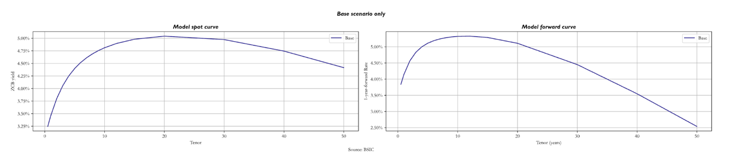 The plots above show the model spot and 1-year forward curves in the base parameter set. As we can see, even if is above 10%, yields go down for long-term maturity bonds due to convexity. For the spot curve, we notice the decrease at the 20-year mark, while for the forward curve right after the 10-year mark.
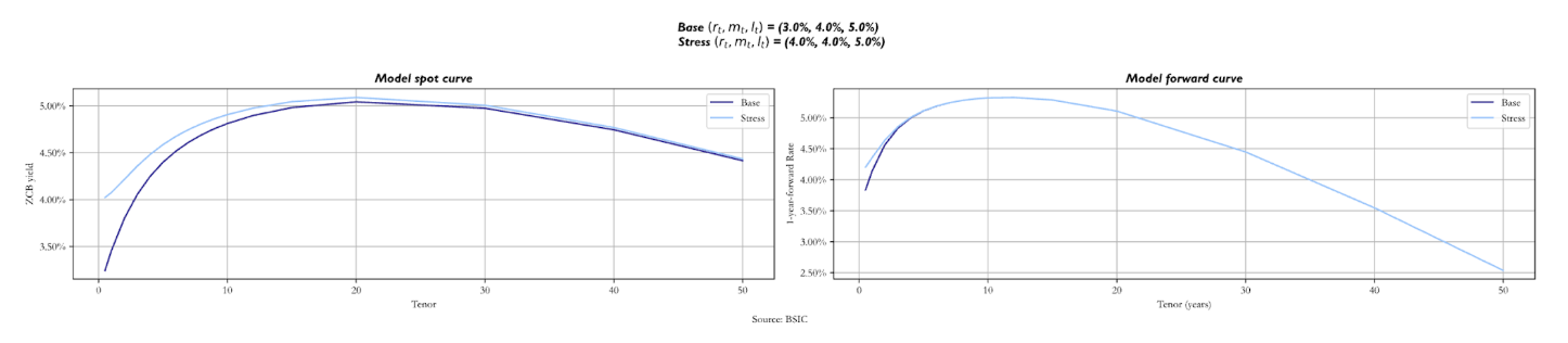
When we stress the three factors, we increase each of them by 1.0% in separate scenarios, analysing how both curves change. As the short-term factor changes, we see how the spot curve changes only in the front end, as mostly drives short-maturity bond yields. Looking at the forward curve, we notice just a small difference in the front end, with the stressed curve above the base one.
 When it’s the medium factor ( ) that we stress, the stressed spot curve starts just above the base, but it’s steeper. The reason is that now we are making revert to a higher value of
  in the same timeframe. Regarding the long end of the curve, they are similar, with the base curve sitting just below. The forward curve looks like the previous one: the only difference we notice is the base curve below the stressed for longer maturities, but not by much.
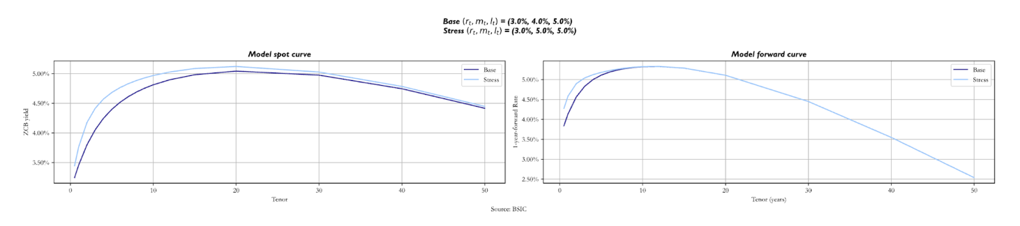
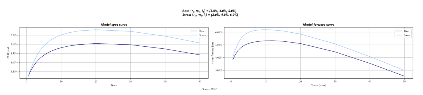
The two curves change by more when we stress the long factor  In fact, not only is the value at which the long-term yields revert, but it also influences the short rate and the medium factor. As the long-term anchor for these two increases, we expect the stressed spot curve to be above the base one, even though they start from the same value. Looking at the forward curve, we notice how the stressed one is steeper at short maturities, as the short and medium-term factors revert to a higher value. The convexity effect that makes curves downward sloping is relatively unaffected by the shift in .
We also report what the curve would look like if we set different  altogether. In particular, we show two sets of factor values that make the curve inverted. We report both a scenario in which they take the values (5.0%, 4.0%, 3.0%) and a scenario in which we have (8.0%, 6.0%, 5.0%).
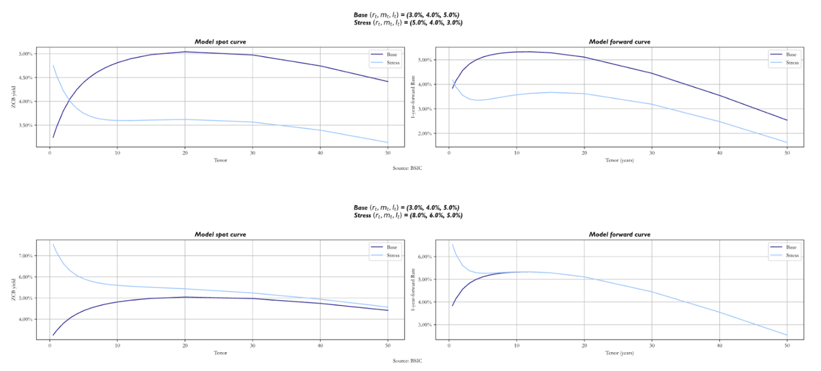
The two curves look completely different, as expected. Nonetheless, we still see the effect of convexity for long-term maturities. Notice how in the second scenario, the stressed forward curve and the base forward curve overlap after the 8Y mark. Analysing the spot curves, also notice how they tend to the same value for long-term maturity bonds. These similarities are given by the fact that both the base and the stressed version have the same value for = 5.0%. The key point to make here is that shifts in these factors affect the path that the short rate will take and hence the rest of the curve.
We now turn our attention to the mean reversion parameters  , analysing what happens to both curves when we stress them, remembering that these values represent the speed at which yields tend to their respective anchors. We must mention that the longer-term parameters cause larger shifts in both curves, so we stressed them by different values.
Starting with the mean reversion speed of the short rate, we stressed it by 0.5. As expected, the most relevant changes for both curves are in the front-end, with the stressed curves being slightly above, even though they start at the same point. We then increased the medium-term parameter mean reversion speed by 0.3. The spot curve does not show significantly bigger shifts than when we stressed upwards by 0.5, with just a little hump near the 10-year mark. The same applies to the forward curve.
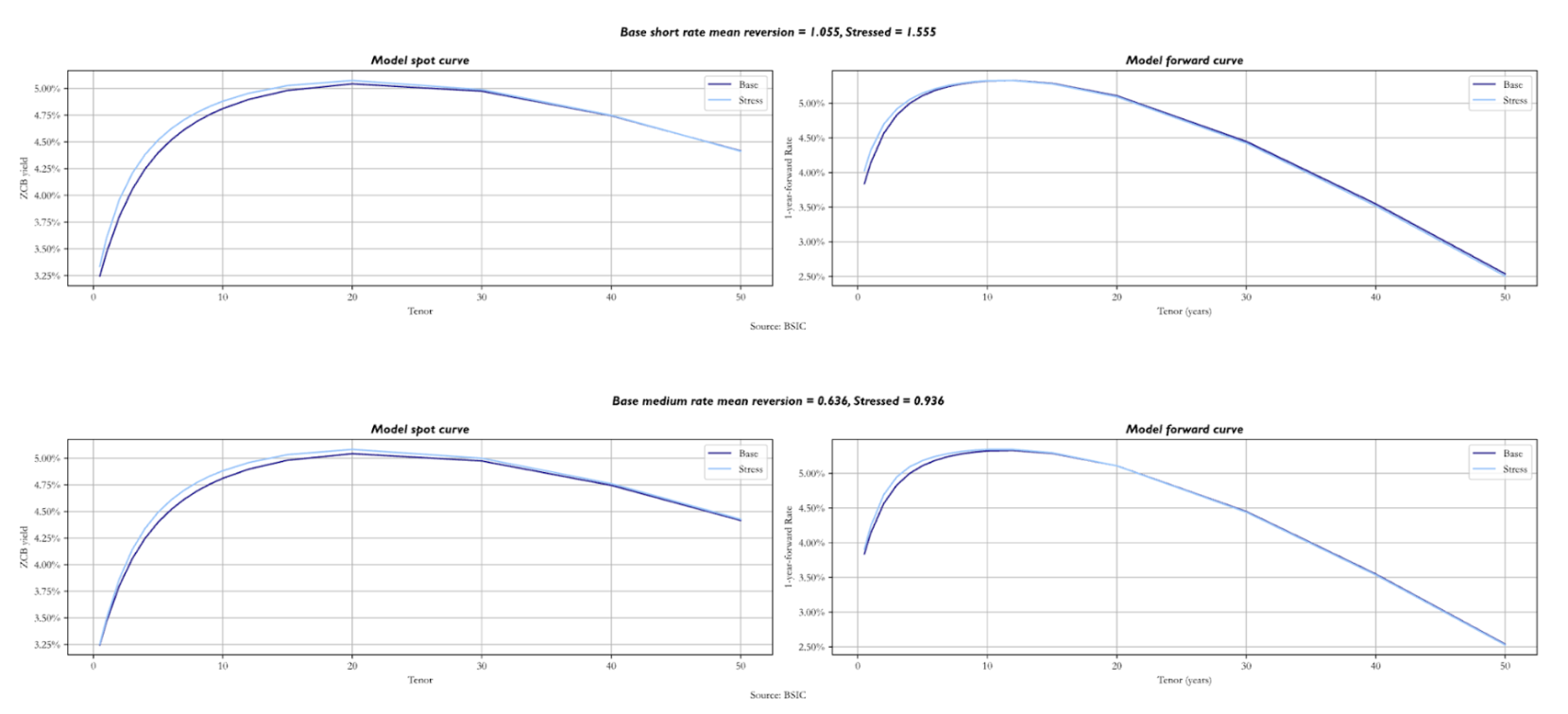
However, it is interesting to see what happens when increases by as little as 0.005. Both curves overlap at the front-end, while the stressed sits above the base for longer maturities. As the long factor’s mean reversion speed is higher, is expected to revert to at a quicker pace, so both curves show higher yields in the long end. It is also worth noting that stronger mean reversion to an anchor lowers the variance of the object it refers to; this feeds down to the variance of long-end yields, pushing it downwards. Because of this, convexity becomes less valuable and its impact on the long end of the curve diminishes in magnitude, via the convexity term mentioned earlier.
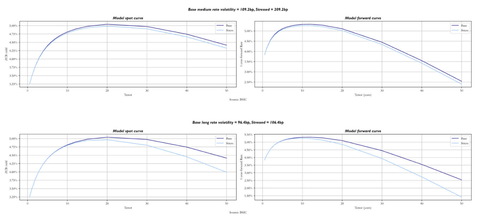
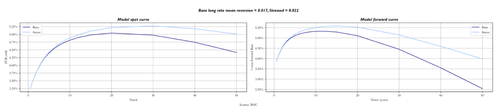 We now analyse the consequences of an increase in shifts in the factor volatilities and the correlation parameter. Stressing by 100 bps we see a downward shift in both curves, starting at the medium-term maturities. Greater factor volatility means greater short rate volatility, which strengthens the value of convexity. As this is most pronounced for long-term bonds, the effect is most visible in the long end of the curves. This effect is even stronger when we stress even by just 10 bps. While the front end changes by relatively little in this example, stressed forward curves are much more humped than in the base scenario, and the spot term structures are shifted lower in the long end.
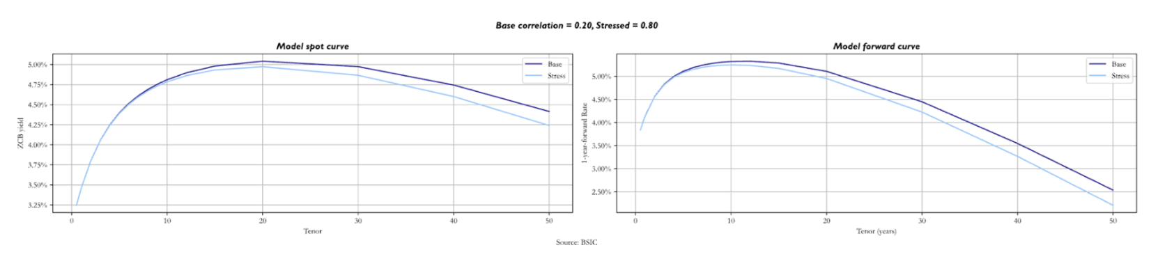
 A very similar effect can be noticed when the correlation between the two Brownian motions is shifted upwards. This is because higher leads to the same effect on the variance of the short rate as an increase in one of the two factor volatilities. The long end is priced at lower yields because convexity becomes more valuable.
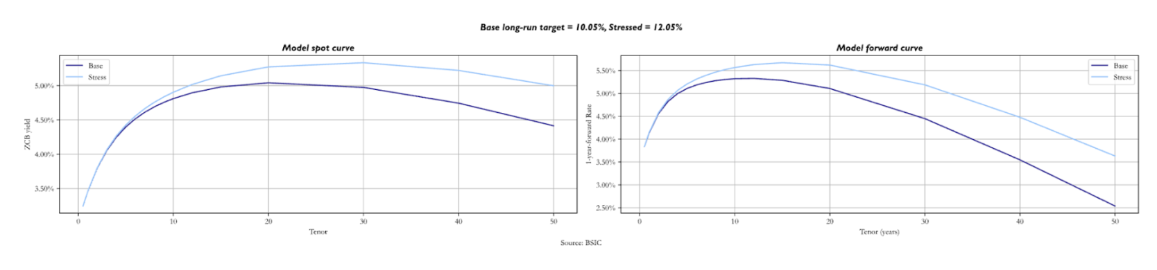
 Lastly, we analyse the effect of an increase in the long-run nominal target by 2.0%. As expected, the longer the maturities, the more both curves are pushed upwards to higher yields. Variations in the spot and in the forward curves are very similar, with the stressed above the base starting at short/medium maturities. The role of convexity in pushing down yields at the long end remains unchanged.
 Calibrating the model
We now turn our attention to calibration. We follow the approach proposed by Tuckman and Serrat (2022). The approach is based on a stagewise calibration of the parameters of the model, starting from mean reversion parameters , then moving onto factor volatilities and correlation inputs – given calibrated  – which we denote by a vector
  , and lastly calibrating given both
  to fit the spot curve as closely as possible.
The first stage of the calibration attempts to find, for a given candidate value of , the values of  that best match the empirical betas of a regression (in first differences) of all tenors in the spot term structure against two benchmark spot yields. Indeed, the model provides a closed form expression for a set of model-implied regression betas that only depend on . We pick to make model-implied betas match empirical betas as closely as possible. In our case, we choose the 2-year and 10-year spot yields as benchmarks, and we regress the first difference of every other yield in the term structure onto the first difference of these two benchmark spot yields. Since this beta-matching approach only looks for an optimum over
  and assumes as a given candidate value, we add a grid-search step over a very fine grid of possible values of
  and we pick the triplet
  that altogether best matches empirical betas of all yields.
Once has been calibrated, we apply a similar procedure to  . In particular, the model implies an explicit form for the variances of each yield, which only depends on and
  In principle, we could use the calibrated and attempt to pick a vector that best matches empirical variances to model implied variances; this is also what Tuckman and Serrat (2022) present. However, we also tested a calibration procedure that matches the full empirical variance-covariance matrix of all yields in the term structure to the model-implied variance-covariance matrix. In order to understand which one performs better, we tested both in a simulation environment to see if they recover the true parameters that we set for when generating simulated term structures following the equations we introduced earlier. We will review the simulation results shortly after having introduced the rest of the calibration procedure.
The reader may also be wondering why we’re calibrating mean reversion parameters of a process defined under the -measure to empirical mean reversions (a set of  quantities). The same question could be raised about diffusion parameters, which have been set to match as closely as possible empirical yield variances (a set of quantities) and not a market input like swaption volatilities. As for diffusion parameters, the reason is that we specified diffusion to be constant. If we had instead chosen any form of state-dependent or stochastic volatility process, then we would have needed to calibrate volatilities under the -measure to a market input. For what concerns mean reversions, by setting them as equal across measures, we’re implicitly assuming that any risk premium linked to the three factors is constant and not state-dependent, which would make mean reversions identical across the and measures. This can be proven easily in a one-factor model such as the Vasicek model. We refer the interested reader to Rebonato (2016) for more information on how the presence of a risk premium affects parameters across measures.
Once and have been calibrated, we can turn our attention to . Given a full parameter set  , and the assumption that two spot (or forward) rates are perfectly priced by the model, one can extract the path of latent factors
  implied by the parameter set and the choice of rates that are perfectly priced. More precisely, a simplification to our approach is that we assume to be observed and equal to a policy rate. When fitting the model to U.S. Treasury yields, we anchor to the Effective Fed Funds Rate; for the Bund curve, we use the ECB’s Main Refinancing Rate; for the U.K. Gilt curve we use the Bank of England’s Bank Rate. Anchoring one of the three latent factors to an observed policy rate implies that if we pick a pair of spot or forward rates, we may be able to obtain a 2-by-2 system of linear equations linking that pair of observed rates to and . This is how we extract
  given a parameter set and a choice for the pair of rates to be used as benchmark for the extraction.
Given and a given parameter set, one can price the entire spot term structure (or even the entire forward surface). So we also have a clear mapping from a candidate to the model term structure that corresponds to it, given a choice of and from the previous calibration stages. We simply pick in order to minimize the sum of squared errors between model-implied and actual yields on each day , applying exponential smoothing so as to give less weight to past data. Following the recommendations in Tuckman and Serrat (2022) we apply a smoothing factor of 0.8/year, meaning we give a weight of 0.8 to a 1-year-old observation of squared errors, a 0.64 weight to a 2-year-old observation, and so on.
For what concerns the choice of points from which we extract latent factors, we choose – once again following the recommendation of Tuckman and Serrat (2022) – the 2-year forward and 10-year forward 1-year rates. An alternative criterion would be to choose the 2-year and 10-year spot rates, but this would make the model predictions of those two yields match exactly the observed values, thus eliminating potential trading opportunities in these two points of the spot curve. Moreover, making the latent factors track a pair of forwards of a 1-year rate gives them a more intuitive interpretation: they could be thought of as a measure akin to an interest rate target.
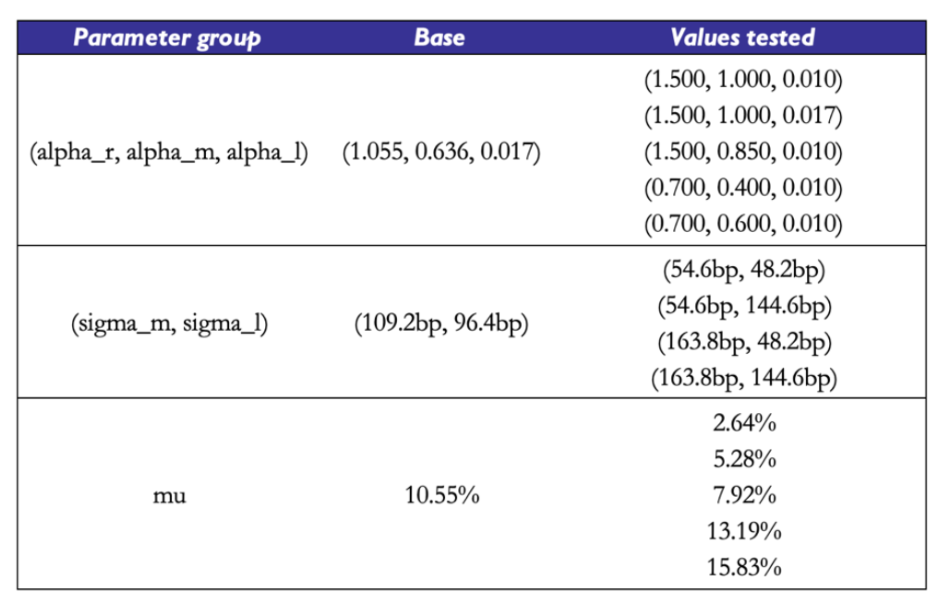
In order to give the reader a better understanding of the pitfalls of this calibration procedure, we report some basic results on how the calibration procedure performs on simulated data. For a given choice of true , we simulate paths of sample size 2000 days of the three factors, under the assumption that their data generating process (DGP) is the one described by the cascade-form equations of the model. Then, we compute observed yields of the whole term structure and attempt to feed these simulated yields to the calibration scheme, to understand if – when the data truly follows the DGP we assumed for the term structure – we may recover the true parameters with sufficient precision.
The base parameter set we use is taken from a real-world calibration example shown in Tuckman and Serrat (2022). We then try different parameter sets with different mean reversion speeds, factor volatilities, correlation values, and long-run targets. To gain a better understanding of the mean reversion speeds, one can refer to the shortcut to compute the half-life of the OU process with  . For example, a value of
  implies that should take
  years to reach the current level of . In each experiment on each parameter subgroup
  , we take different values of parameters within the subgroup and fix the other parameters’ values to those of the base set. To get a broader picture of how effective the calibration scheme is, one should test it with a much larger array of parameter sets, and with different realizations of the Brownian Motions involved in the DGP. We report a few simple examples with a small number of parameter sets for intuition.
 We find that the recovery of is not the true bottleneck of the procedure. The calibration results show attempts to calibrate
  to the observed (simulated) term structure with perfect knowledge of the underlying
  . We report the results that we would obtain with
  being taken from the base parameter set, but we observed similar evidence with the other parameter sets as well. The calibration scheme, when fed the right values of correctly recovers the true value of and the true path of the latent factors. So in principle, with a good calibration scheme for both mean reversions and volatilities, we could get a great fit to .
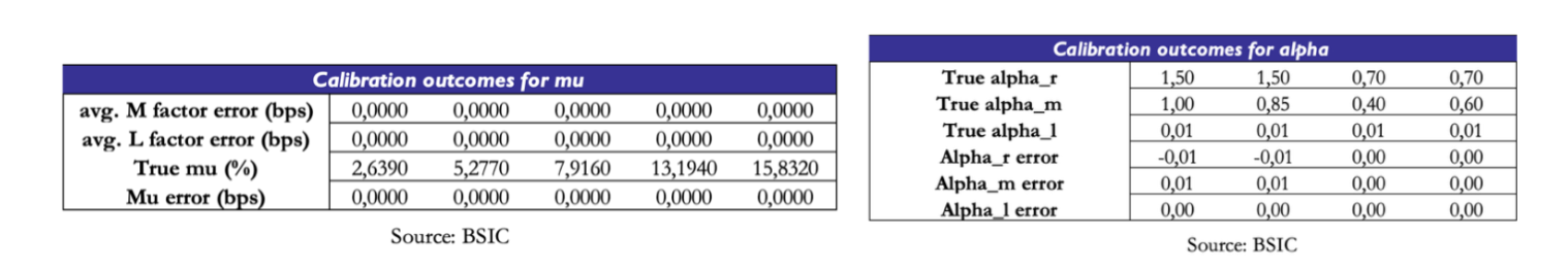 What about the precision of the mean reversion estimates? Could they be the weak link of the chain? The evidence says otherwise. Under different parameter sets, the data on shows near-perfect recovery of all three parameters. We’re confident that errors of the magnitude of 0.01 are simply due to the fact that the grid of candidate values we used in the grid search step to calibrate is in steps of width 0.01.
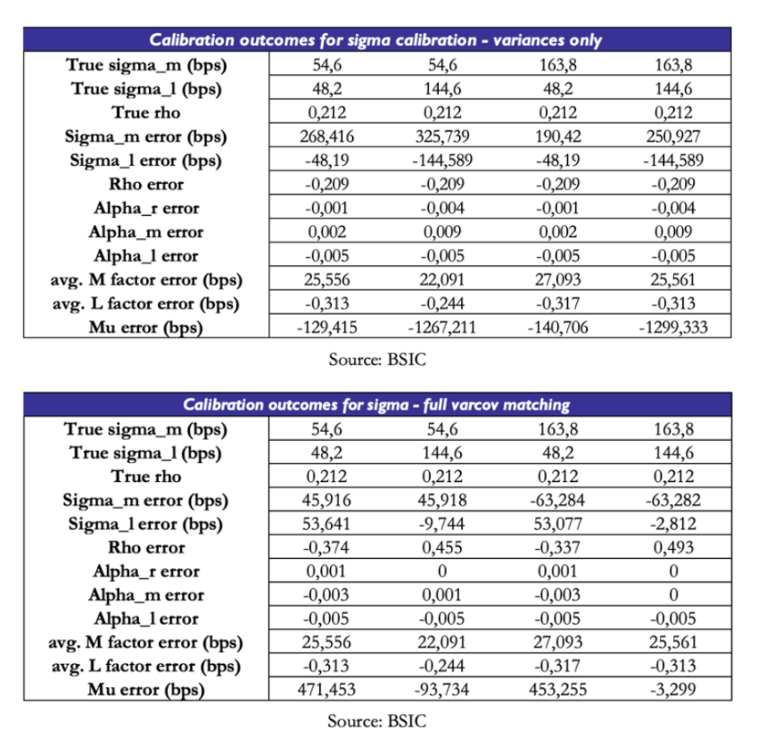
The real issue lies in the estimation of . We test, for different sets of values of , the effectiveness of two calibration schemes: one attempts to match model-implied variances of each yield to observed variances; the other tries to match the entire model-implied variance-covariance matrix to the observed one. The results are incredibly disappointing. When matching variances only, the optimizer pushes one of the two volatilities and the correlation parameter to near-zero values. In order to compensate and obtain valid fit to the spot curve, is also pushed to extreme values. When matching the full variance-covariance matrix, the results are slightly more encouraging, but the scheme still fails to recover the true parameters. However, given the relative improvement over the other method, we will stick to matching the full variance-covariance matrix when calibrating the model to real data.
We have to acknowledge that this calibration procedure has its own weaknesses. While recovery was smoother than other parts of the procedure, the true challenge remains the identification of . We’ve seen how perfect knowledge of and would lead to perfect recovery of , so the real bottleneck truly is the recovery of . Moreover, an implication of the bottleneck in estimation is that must compensate for errors of fit. This is a key point of caution when reading calibration results from real data.
 Dealing with risk premia
Everything that has been said until now regarding the model has been a statement regarding the -world. Our readers may be wondering if we will also provide a specification of the model under the measure. One of the assumptions of the model as presented in Tuckman and Serrat (2022) is that only the long factor carries a risk premium, which provides a simple identification procedure. What does this mean in practice? Recall that the instantaneous drift of any asset under the measure is . Under , the drift will embed an additional compensation for risk, should be larger for bonds that have a higher sensitivity to the long factor (given by their duration and model factor loadings), and that depends positively on and on a market price of risk  .
.
We provide basic intuition for the procedure, and we refer the interested readers to our appendix or Tuckman and Serrat (2022) for more details. Consider a strategy that at time buys a zero-coupon bond with maturity  and sells a zero-coupon bond with maturity , and liquidates the portfolio at time . The returns of this strategy can be expressed as:

Where  is defined as the log price of a zero-coupon bond at time with maturity (note how this can help us define forward prices of bonds too). One may re-arrange the expression and divide by
  to re-write it in terms of two forward rates:

Where  is the forward rate with maturity and tenor . We omit the for convenience.
When given a parametric form for , one can derive via Ito’s lemma the drift of  and express the expected returns (under ) of the strategy in terms of the market price of risk of the long factor and two quantities that are linked to the choice of
  other than model parameters . We will refer to these quantities as amount of risk terms, one for exposure to the long factor
  and one for exposure to convexity
  (which is most relevant for high-duration items):

Another assumption made in Tuckman and Serrat (2022) that allowed us to write this identity is that  is a very persistent process (not necessarily constant) so that one may approximate
  . This assumption brings a massive advantage in terms of analytical tractability even beyond the computation of the risk premium. As we mentioned earlier, it can be shown that when is constant the parameters under the and measure coincide, which means we can use one calibration scheme for both much like we did. However, the plausibility of this assumption is debatable. Duffie (2002) found that constant- ATSMs produce yield forecasts that are worse than those of a random walk. Moreover, significant evidence in Fama and Bliss (1987), Fama and French (1989, 1993) and Cochrane and Piazzesi (2005) suggests that excess returns on bonds are correlated with a return-forecasting factor, which depending on the specific paper is either described as the slope of the yield curve or a linear combination of five forward rates. We refer the interested reader to Rebonato (2016) for a detailed treatment of the topic.
Sticking with the assumption that , the next step is conceptual: we assume that beyond a given horizon far out in the future, views of the short rate are identical. In other words,  for any
  and for a given
  . One can show that if we pick two maturities
  of forwards with tenor we can write:

If we pick and  to suit the role of
  mentioned earlier. This means that one can simplify and obtain an expression for :

So for a given choice of  one may obtain an estimate of that allows to distinguish the -expected path of the short rate in the future from the -expected path, which is simply a set of forward rates with different maturities and extremely short tenor. This could be useful to (a) quantify risk premia in the forward curve and (b) compare the -expected path of the short rate to other survey estimates to express a macro view on expectations in the short rate.

The key criticality is the choice of . Using the data at hand, we obtained very different estimates of in the same period using different choices of . As the identification of risk premia is likely to be a topic deserving a discussion of its own, we do not cover it in more detail in this article and leave as a potential expansion to be developed in the future. Indeed, we will only talk about Gauss+ as a relative value tool and not as a filtering scheme to discern risk premia in bonds.
Fitting the model to real data
We use three datasets provided by the Federal Reserve, the German Bundesbank and the Bank of England containing bootstrapped zero-coupon rates on bonds issued by, respectively, the U.S., German, and U.K. governments. The methodologies they use are similar in principle but differ in the interpolation method used. All three central banks fit their choice of model to price a very wide set of bonds, under some filtering criteria (e.g. applying a filter to exclude specials or to exclude bonds with very short maturities). The Fed and the Bundesbank use a Nelson-Siegel-Svensson methodology, while the Bank of England uses a spline-based interpolation method.
Could we apply the model to other Euro Government Bond term structures (e.g. Italy or Spain) other than that of German Bunds? No, as it would be in stark contrast with the premise that we’re modelling yields on risk-free bonds. The key point is that here “risk-free” is intended relative to all other securities with payoffs denominated in the same currency. We’re choosing German Bunds to be the risk-free benchmark for the Euro Area. One could also argue that OIS rates are the true risk-free object we should model, and indeed the model would be applicable to them as well – since a fixed receiver position in an OIS swap is akin to a long bond with financing.
We chose to use central-bank-produced series of curves rather than performing a bootstrap ourselves as the choice of the filtering criteria for the benchmark bonds is nontrivial, and similar considerations apply to the interpolation methods chosen. There would probably be enough material on these two subjects to write a standalone article on curve construction. If we had chosen to apply the model to swap curves instead, we would have avoided the issue of defining a filtering scheme. However, we would have had to deal with small sample sizes for USD and EUR swaps (SOFR swaps started trading in 2018, ESTR swaps in 2019), and with the need to use different OIS curves for discounting in the bootstrap procedure depending on the sample period (for EURIBOR swaps, we would’ve used EONIA OIS until ESTR OIS became available). Perhaps we could’ve chosen to work only on GBP SONIA swaps, but it remains unclear to what extent the SONIA reform of 2018 would’ve caused a structural break in our data series. These considerations may aid future developments of articles on similar topics.
We fit the model using U.S. Treasury and German Bund data from January 1st, 2014, to December 31st, 2021, and using U.K. Gilt data from January 1st, 2016 to December 31st, 2023. The difference in sample periods is simply due to the fact that the Bank of England did not report zero rates for maturities above 25 years before 2016. We fit the model on all available maturities between 1 and 30 years in breaks of 1 year. Since the Bank of England dataset contains data for more maturities in the front-end of the curve (any yield between 1 year and 5 years in breaks of 0.25 years) we chose to integrate those as well. We found that when given yields of maturities in breaks of 1 year, the model fits the front-end of the curve relatively poorly. Perhaps this is due to the fact that the front-end of the curve tends to (statistically speaking) behave in a more independent fashion from the rest of the curve. Perhaps, when told to optimize to match observed empirical quantities related to a set of 30 yields, of which only 4 belong to the statistical cluster of the front-end, the optimization procedure finds an optimum in which the front-end is poorly fit at the benefit of the rest of the curve. Hence the case for including more front-end yields when available.
We begin by reporting the parameter estimates for each of the three term structures we examine. The estimated mean reversion speeds of the short rate are considerably different across term structure, and without further examination, they would suggest that the short rate reverts to the medium rate most quickly in the U.K. and least quickly in the Euro Area. Without jumping to conclusions, we can simply attribute this difference to the numerical distance between estimated and the short rate in the sample period: as we will see later, the estimated values of in the Bund term structure stayed negative for a larger part of the sample compared to the other two curves, and being monetary policy constrained by a zero-lower-bound, the estimation attributes a slower mean reversion speed to the short rate because it remained far from the medium factor for relatively longer time.
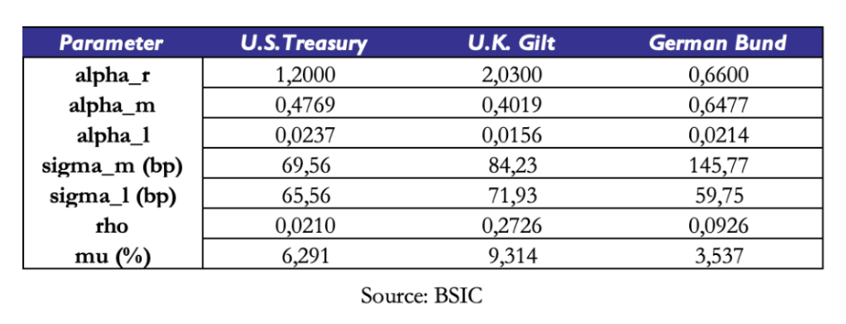 Applying the shortcut mentioned earlier to compute the half-life of the long factor in each of the three term structures, we see that half-lives extend beyond 30 years in each of the three curves. This is an indicative estimate of how long it takes for to complete half of its path to decay towards .
Our readers may be wondering why takes relatively high values compared to the history of interest rates in the U.K. and the U.S. A key point to make is that this value is defined under the measure, since it is fit to a cross-section of market prices (observed ZCB term structures). Therefore, it includes a risk premium and under the assumption of a positive risk premium, we should expect  .
.
We also briefly comment the quality of fit obtained via the calibrated to empirical objectives. We report below some results obtained on the U.S. Treasury term structure, and we report those for U.K. Gilts and German Bunds in the appendix.
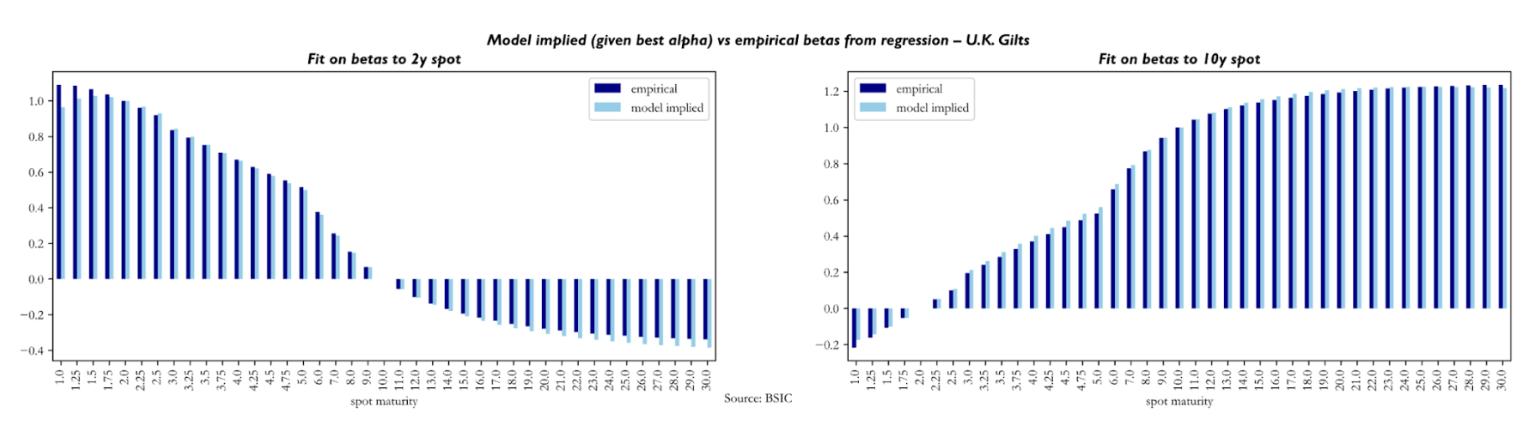
To assess the quality of fit obtained through , we compare empirical betas of yield changes in spot yields to yield changes in the 2y and 10-year spot versus empirical counterparts. The reader may notice how the beta of 2y (10-year) yield changes in the left (right) plot is 1.0 (0.0) while the one to 10-year yield changes is 0.0 (1.0). The main conclusion to be made here is that the model produces empirically plausible betas.
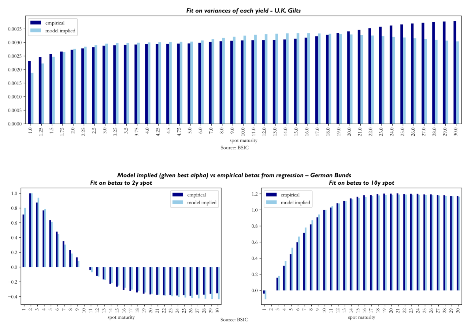
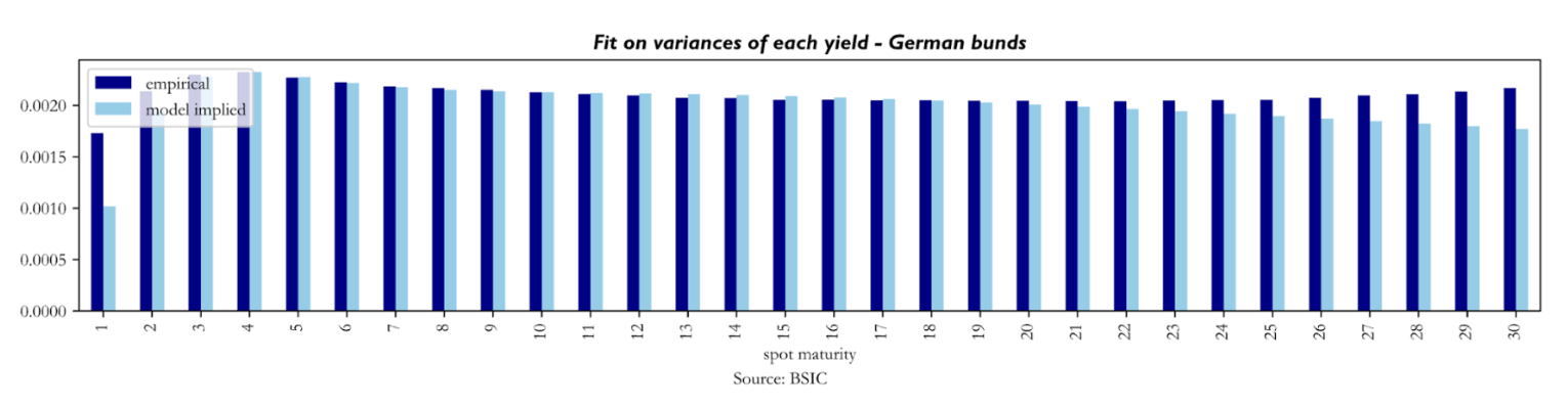
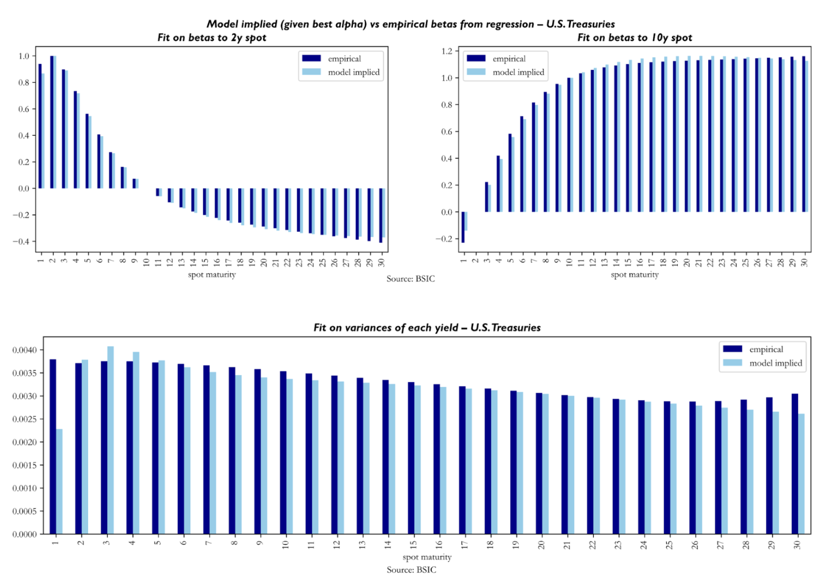 To understand the quality of fit achieved with , we look at model-implied variances of each yield against their empirical counterparts. It seems that the calibration struggles relatively more with reproducing empirical variances in the front end and sometimes also in the long end (especially in the U.K. Gilt curve results). Not much else can be said about these, as we know from our simulation tests that the recovery of diffusion parameters is the weak link of the calibration procedure.
We now turn to the results concerning the latent factors extracted by the model. The three charts below display the time series of the estimated latent factors , , and extracted from U.S. Treasury, German Bund, and U.K. Gilt zero-coupon curves respectively. A key point we must mention is that we calibrated the models on a sample of 8 years of data, but we’re recovering the factors for all dates in the dataset made available to us.
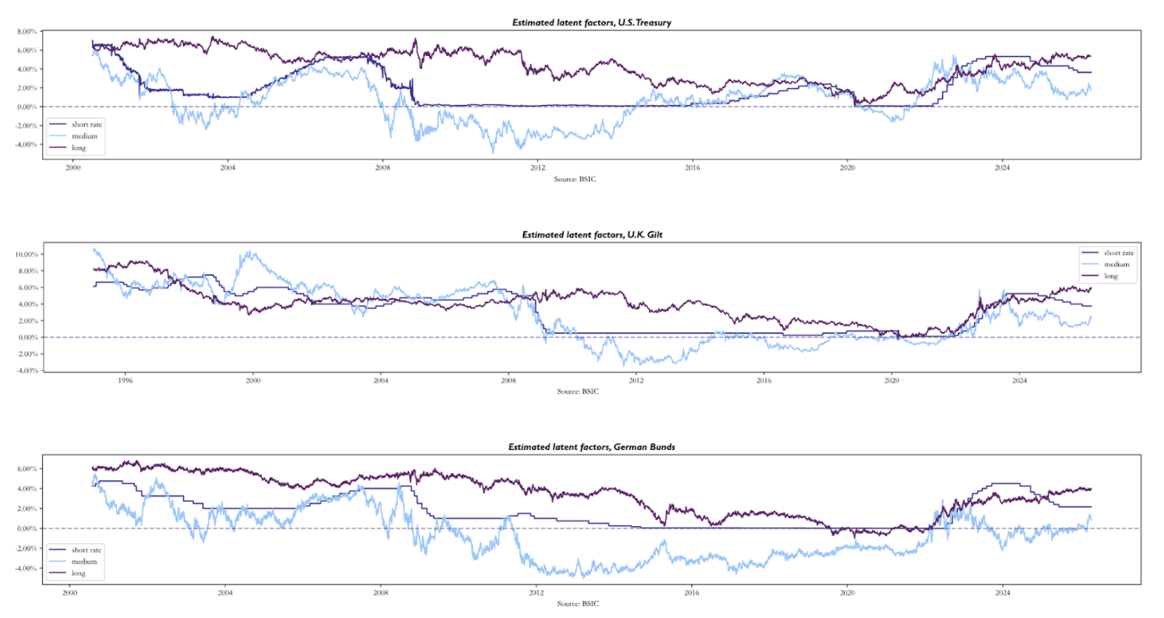 Across all three markets, the charts reveal a set of patterns that are economically intuitive. The long factor evolves as a slow-moving market consensus about the long-run neutral rate: across all three markets it declined slowly and consistently, before recovering sharply due to the post-2021 inflation. As we mentioned earlier, the short rate is anchored to the relevant policy rate, tracking central banks’ decisions across the time window.
The most economically interesting factor is . Being computed as a function of the 2-year forward 1-year rate, it acts as the market near-term interest rate target, much like is a longer-term interest rate target as it is anchored to the 10-year forward 1-year rate. It is both more volatile and more forward-looking than the other two. Its key feature across all three panels is the large spread it creates compared to the , during stress episodes as in 2008-2009 and 2022-2023. In addition, through much of the 2010s, plunges well below both and , at times turning deeply negative even where policy rates remained positive. To explain why the medium factor turns deeply negative, reaching levels no market participant genuinely expected to see in actual policy rates, we believe it can be interpreted as a “shadow rate” factor: the rate level that would have been the medium-term target had monetary policy been unconstrained by a zero lower bound. The model, imposing no lower bound by construction, is free to push to whatever level is needed to fit the observed compression in the forward curve. The charts also show that the direction, rather than level, of the factors may be more interpretable. For example, all three medium factor time series began trending upwards long before central banks hiked rates in 2022. This is because the factors are simply a re-interpretation of the market’s (risk-neutral) expectations of the path for monetary policy.
To verify how well the model fits the observed yield curve on a day-to-day basis, we compute, for each day in the out-of-sample period, the vector of residuals defined as the difference between the observed ZCB yields and their model-implied counterparts across all maturities. We then report the average root mean squared fitting errors across maturities and time.
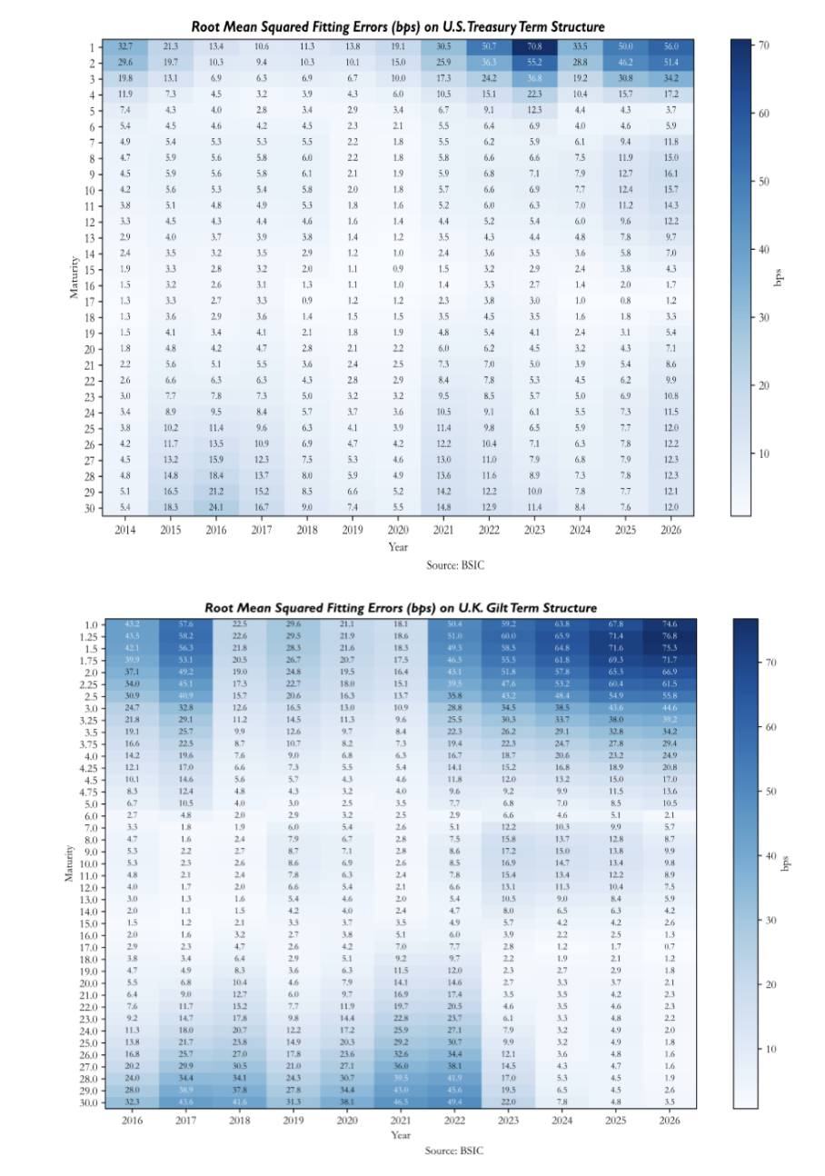
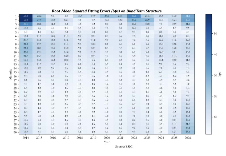
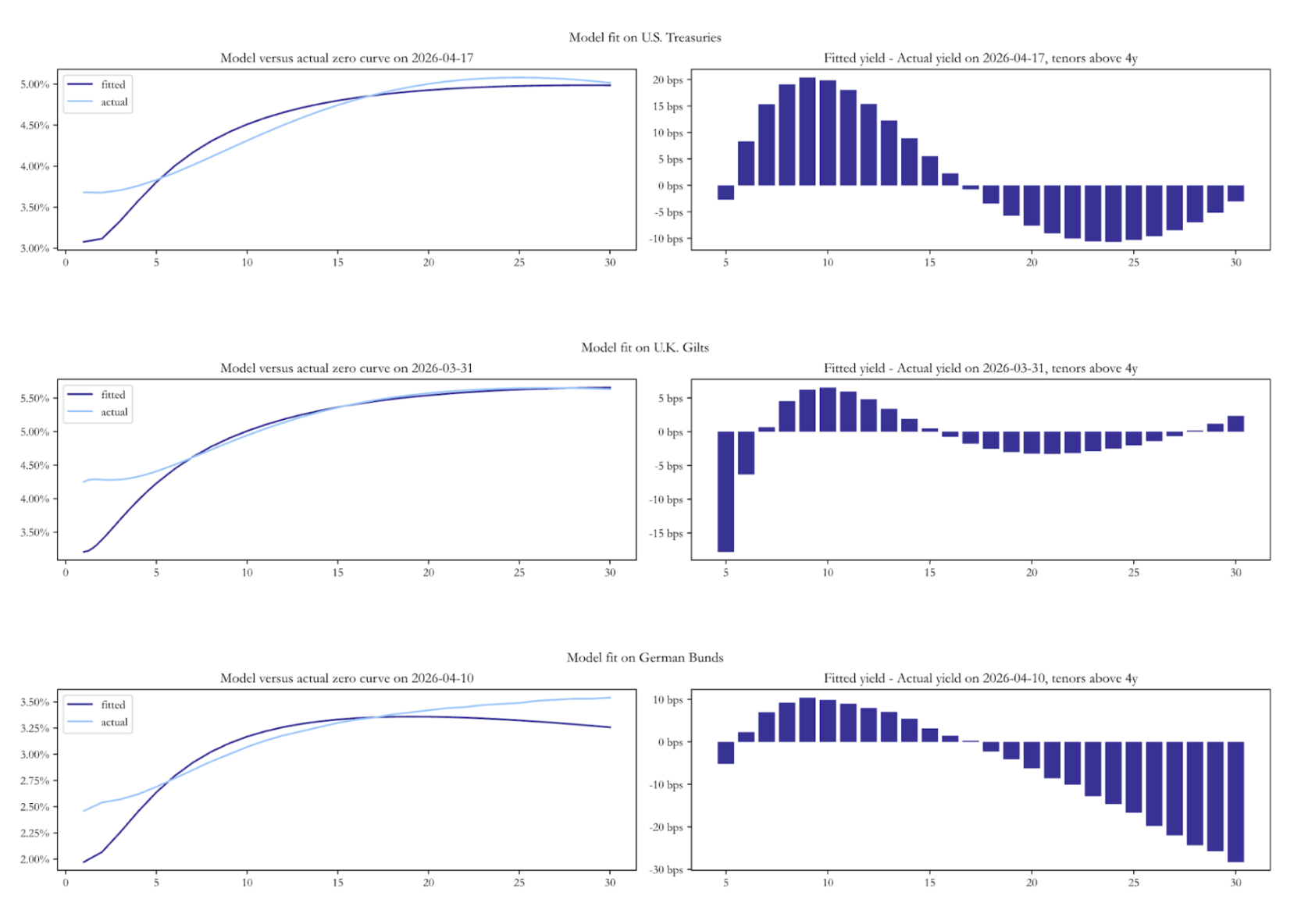
The heatmaps of root mean squared fitting errors reveal patterns that are both maturity- and market-specific. We remember that the in-sample calibration lasts until 2021 for Bunds and Treasuries, and until 2023 for Gilts, therefore the errors after these dates are particularly significant. All three heatmaps show that the model tends to misprice the front end more than the rest of the curve. For German Bunds, errors are very large early in the sample, while between 2017 and 2022 they compress significantly. In the out-of-sample period, and specifically after 2024, we see that errors deteriorate both at the front end and the long end. For U.S. Treasuries, the out-of-sample deterioration is more severe, with front-end errors reaching significant values of 70bp in 2023. The U.K. Gilt panel shows a less structured pattern, with large errors dispersed across maturities and time periods. Early in the sample and in the out-of-sample period the model seems to have significant errors in the front end, while between 2018 and 2022 errors appear larger in the long end. The belly remains the most consistent region of the curve across the full sample.
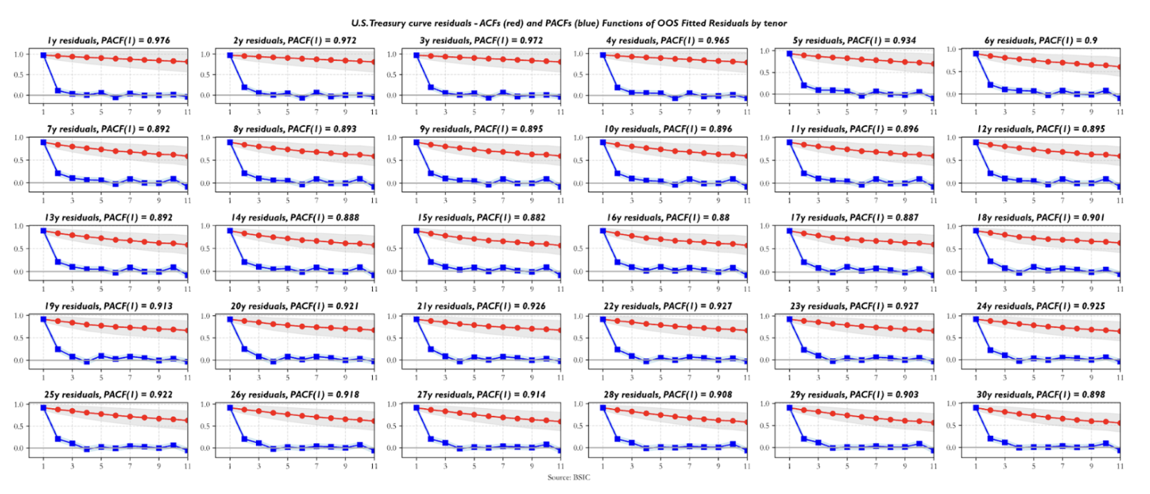
To close the section on fits to real data, we present a snapshot of the model-implied spot yield curve against the observed zero-coupon curve as of the last available date in each dataset. Across all three markets the fitted curve undershoots the actual curve at the very front end. Beyond the front end, the residual structures diverge. For Bunds, the model is well-fit through the belly but increasingly overshoots the actual curve at long maturities. For U.S. Treasuries, the pattern is different: the model overshoots the actual curve in the belly, before turning modestly negative beyond 18Y. For Gilts, the most prominent feature is a sharp -15bp residual at the 5-6Y maturity, the model sees that point of the curve as significantly cheap. These snapshots are the natural entry point for the relative value analysis that follows.
 Historical Performance of Predictions
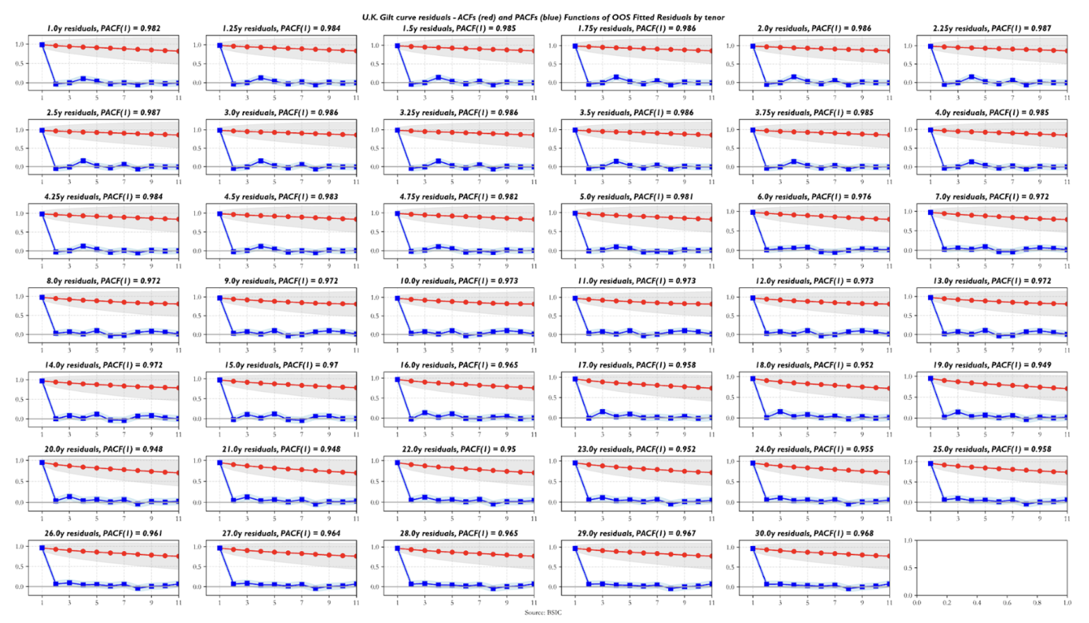
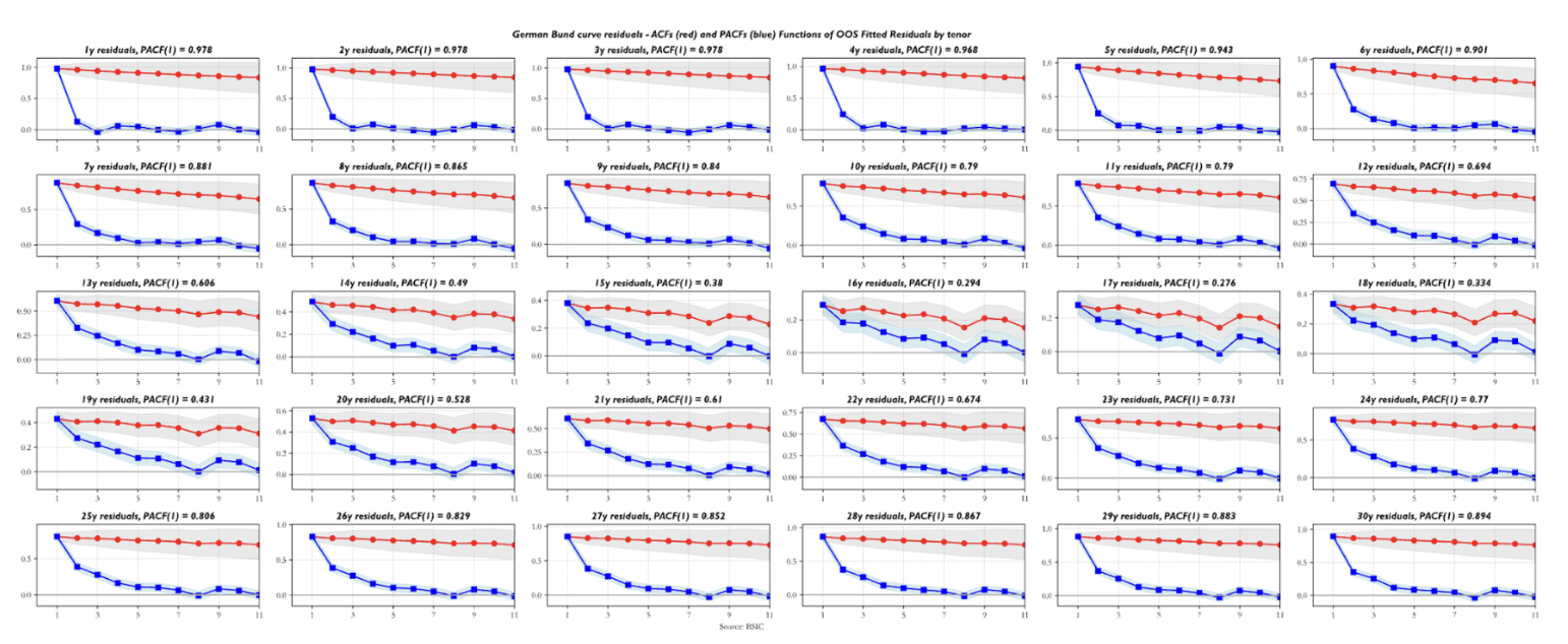
Are the residuals valid indicators to trade value in the yield curve relative to the two benchmark forwards we chose? Before arguing that residuals should indeed be used as a relative value indicator, we ask some questions about their statistical properties. The first step is looking at their serial correlation. The sample autocorrelation function (ACF) and partial autocorrelation function (PACF) estimates show that all residual series exhibit autoregressive behavior. The striking detail is how front-end residuals show near-unit-root structure, which, if indicative of a random walk process underlying the observed data, would make them less suitable for trading applications. Residuals in the rest of the curve show relatively more encouraging ACF/PACF estimates, in the sense that their first order AR coefficients are relatively low and suggest that the half-lives of the signal may be short enough to consider them valid trading candidates. The plot below shows the ACF/PACF estimates for U.S. Treasury residuals, but the behavior shown by those of U.K. Gilt and German Bund residuals is qualitatively similar. The differences worth mentioning are that German Bund residuals exhibit the lowest first-degree persistence estimates (especially for yields in the 10y-20y sector) while U.K. Gilt residuals display a higher level of persistence across maturities compared to the other two term structures.
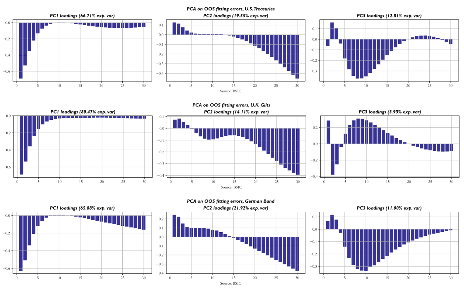
 Next, we apply principal components analysis (PCA) to the residuals of each curve to understand the empirical correlation structure they display across tenors of the same curve. The key similarity is that front-end residuals tend to move in a relatively independent fashion from the rest of the residuals, as shown by the loadings of the first principal components, which in all three term structures explain around 2/3 of total variance or more. The second PCs on the other hand seem to group together yields in the long end and sometimes also in the 10-year-20-year sector. The third PCs group together a remaining cluster of tenors that are not included in the first two and sometimes display negative loadings for front-end yields. The first three PCs of each curve explain slightly more than 95% of total variance across residuals, which suggests that this probe is sufficiently deep to understand the patterns with which residuals move together.
What do we do with this evidence? Well, in an idealistic world we would hope for residuals across tenors to be perfectly uncorrelated and idiosyncratic, while this is not the case empirically. If we assume the correlation structure to be the same in the future as well, then we can be more aware of the risk implications of a portfolio that trades multiple tenors on the curve. We will know that our bets on yields are not independent of one another and thus the marginal bet may not be adding uncorrelated returns to a portfolio that contains others.
Before we go any further, a key point to make is that the data at hand do not suggest that the residuals are zero on average. This is a key weakness of the model. A possible cause underlying this observed effect is that the input data we fed the model come from a smoothing step with higher-dimensional structure (e.g. a Nelson Siegel model with four factors) which means that residuals coming out of Gauss+ are partly due to the dynamics of the smoother that the model cannot capture. However, we may still be interested in evaluating how valid the model’s directional predictions are, and in order not to rely on the unconditional mean of residuals being zero, we test a signal based on a rolling two-week Z-score of the residuals.
More specifically, we use a 14-day window to compute a rolling Z-Score on each mispricing in outright/level/butterfly levels. We enter a trade whenever the Z-Score is above a certain threshold. We set our profit target to a 14d rolling Z-Score of 0, and we fix a stop loss in Z-Score units at inception of the trade. Why do we set profit targets and stop losses at inception? Using a rolling Z-Score as exit criterion would lead to mechanical exits from trades because of the passage of time and its impact on the Z-Score. Suppose we observe an abrupt jump in a residual series, and we enter the trade, updating the Z-score with new rolling mean and standard deviation estimates every day until it suggests that we shall exit the trade, either because it reverted to zero or because it hit our stop loss. Quite often we will end up exiting the trade simply because the mispricing value doesn’t move far from its new level, which makes rolling mean estimates mechanically drift towards the new level with time, hence leading to potential premature exits. If we instead set the exit criteria at inception in price terms (e.g. entry at 8bp, take profit at 6.24bp, stop loss at 9bp), we test a setup that would give a better picture of what we would do in reality, were we to bring the model to production as a screening tool.
In addition to the rolling Z-Score logic, we add an additional filter to understand what mispricing series have recently gained reversion momentum. In practice, we compute the difference between a short-lived (5-day) moving average of the residual series and a long-lived (40-day) moving average and use it as an indication of the direction of the signal. For example, if the model is flagging that the fair value of the 5-year should be 4.75%, but the actual datapoint is 4.90% (assume that this is consistent with a given Z-score threshold to enter the trade), we look at the sign of the reversion signal to understand whether the residual is trending in the right direction. Since we define residuals as (Actual – Model) we’d hope for the reversion signal to be negative, meaning we’d want evidence of the residual trending down, with actual yield converging towards model yield.
For intuition, we show an example of how the model would’ve traded the U.S. Treasury 10s30s curve between 2023 and today. From the charts showing the model-implied and observed level of the 10s30s, we see that the mispricing is currently positive and has been persistently positive since the end of 2024. Nonetheless, the rule we defined still performed a few trades betting on the local (not global) correctness of the model, in that residuals tend to revert to a local mean. In the backtest shown, we used a Z-Score of 2 as the entry threshold and we set the stop loss threshold on a trade-by-trade basis as the entry Z-Score plus 1. As mentioned earlier, the Z-Scores are calculated with the mean and standard deviation being set at inception of the trade looking back 14 days.
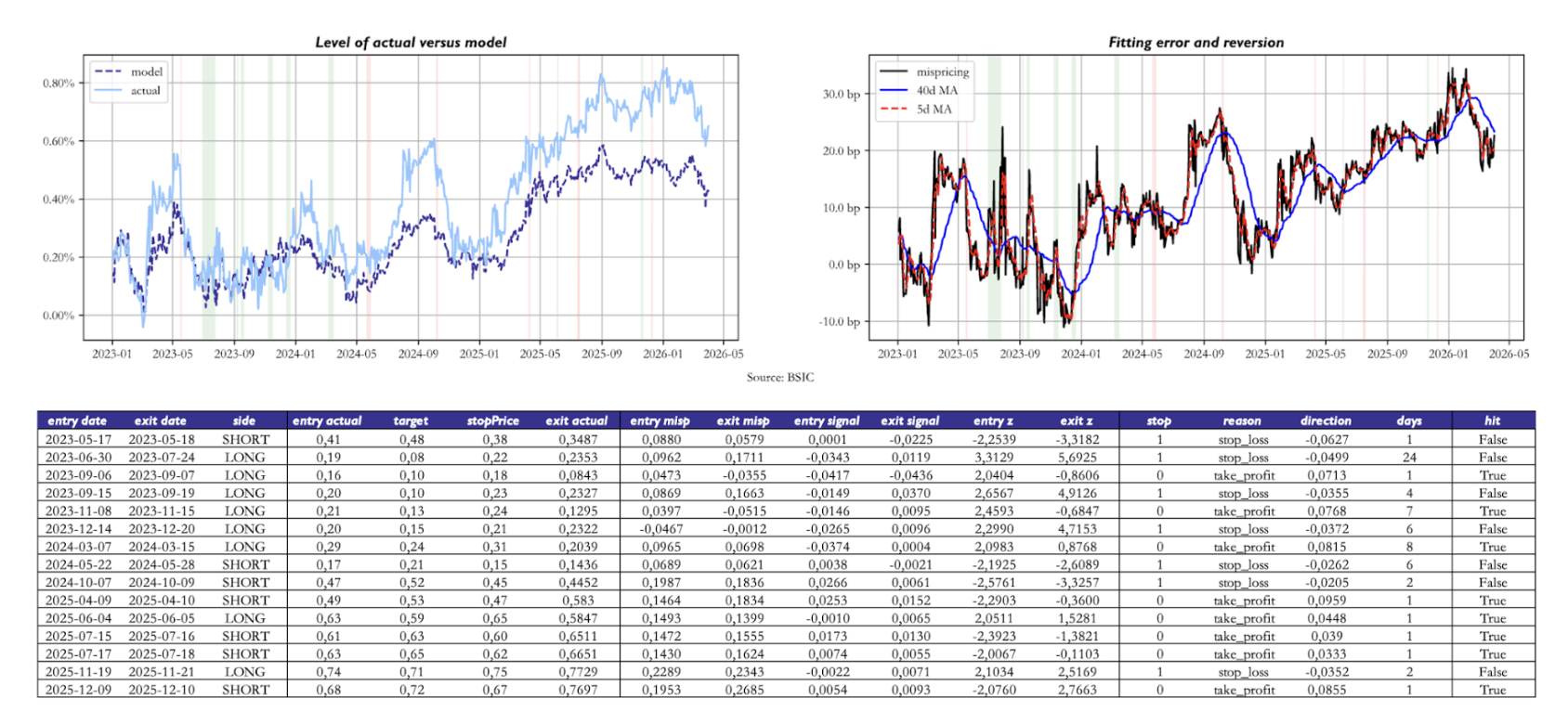 Two caveats apply to the data we present. First, the object of study in the above plot was a 1:1 weighted 10s30s position. When implementing this trade in practice, one should instead adopt hedge ratios based on DV01 hedging, PCA hedging, or – if one feels very confident in how precisely the parameters are estimated and hence the resulting factor loadings to – even with a hedging methodology based on the loadings to the three factors. Recall that the three factors are deterministic functions of the central bank’s policy rate and two forward rates we chose. Second, the above table reports, in the “direction” column, the move in the 10s30s after the prediction was made. This entirely disregards the presence of duration and convexity when we compare the model’s prediction accuracy on different points of the curve (or curves/butterflies).
Bearing in mind these two caveats, we now show summary statistics that give us a picture of the directional validity of model residuals as a relative value indicator. We test the same strategy outlined earlier (with the same entry/exit criteria) on outright yield levels, but also on all curve trades and butterfly trades with a spacing of at least 4 years between the legs of the trade. Why the choice of a minimum spacing between the legs? We wanted to avoid getting artificially good results due to the methodology underlying our data sources. Suppose we were to observe incredibly high hit rates on 8s9s10s butterfly trades. It’s very likely that if we observed the trade-by-trade performance we would see that most of these come from 1bp moves in the fly away from its entry level, which in turn could be artificially due to how the central banks’ bootstrap filter recomputes one yield relative to another and then rounds to two decimal places when reporting. Adding a minimum spacing filter reduces the likelihood of this happening.
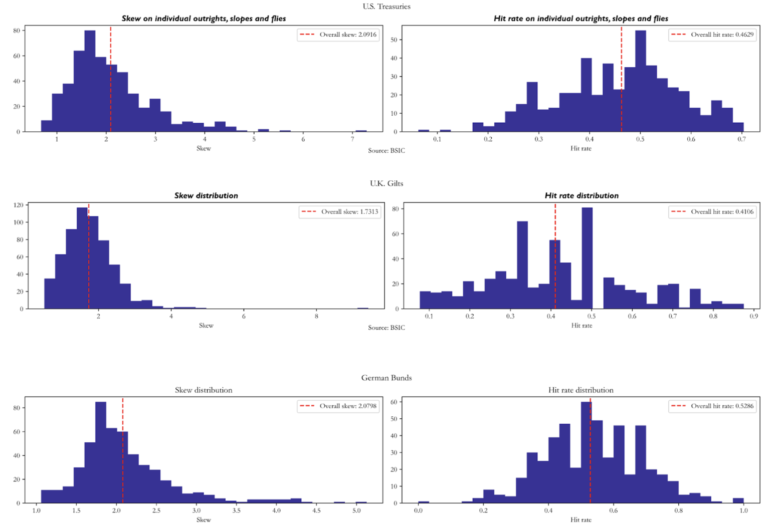
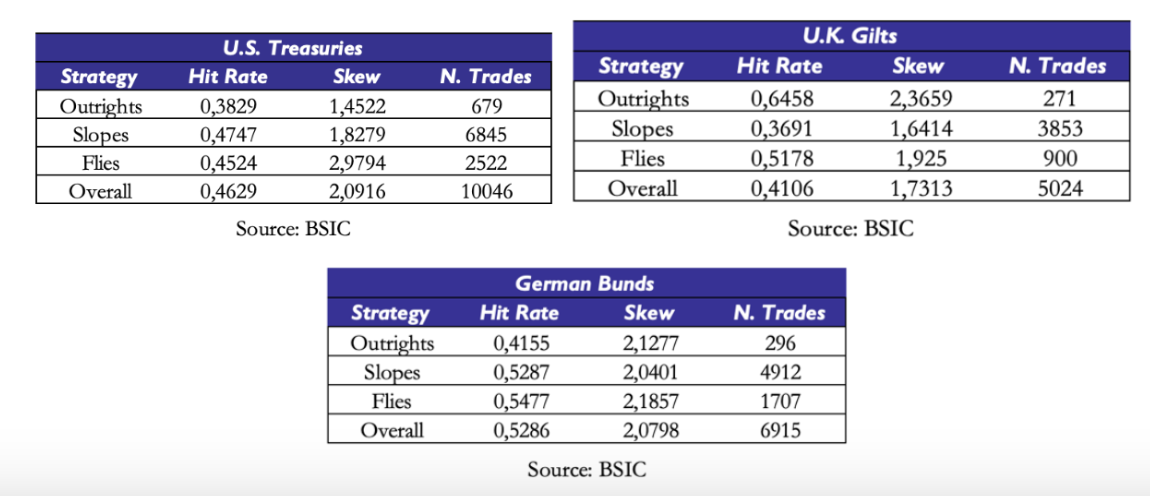 Hit rates tend to be below 0.5 with skews mechanically above 1.0 due to the risk/reward parameters we set in the entry/exit criteria of the strategy. We should put particular caution in the interpretation of the summary statistics on U.K. Gilts: the out-of-sample portion of the data is half as long as the other two curves, and indeed we have relatively a little number of trades per item (e.g. we only trade certain outrights 4 times in the out-of-sample portion). To mitigate the influence of outright/curve/butterfly trades where we traded rarely, we report number of trades-weighted averages of skew and hit rate.
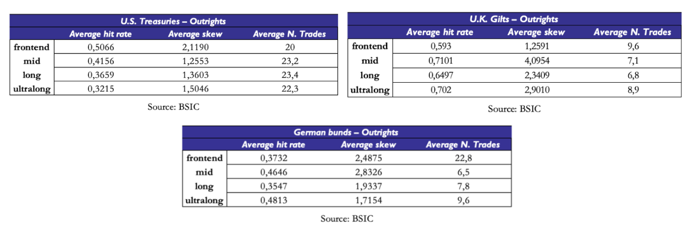
One may also question the interpretability of hit rates across all maturities given the correlation structure we saw when we applied PCA to residuals. We saw that certain very large groups of tenors tend to have residuals that move in the same direction. But what are the hit rates within each cluster? We divide the curve into four buckets: front end (yields below 4 years inclusive), mid (between 5 and 15 years inclusive), long end (between 16 and 24 years inclusive) and ultra-long end (between 25 years and 30 years inclusive). Once again, hit rates on items where we did 7 trades are relatively less interpretable. Items that we traded more often (U.S. Treasury buckets, as well as the front-end of the German Bund curve) show varied hit rates, all below 0.5. One would have to collect more data to get a precise estimate, but the picture provided by the available evidence doesn’t suggest the presence of a significant edge in outrights.
We repeat the segmentation into the three buckets for curve trades and butterfly trades. Once again, where hit rates are highest, they’re calculated on very small sets of trades on each item. However, certain sets of curve trades exhibit interesting statistics. For example, curve trades between tenors in the mid and long buckets of the U.S. Treasury curve show a hit rate just above 44% with a skew of around 2.08. Also, curve trades between tenors of the front-end bucket and mid bucket of the German Bund curve had a skew of almost 1.92 with a hit rate of just below 46%. A potential reason why curve trades on long end versus ultra-long end tenors may show better statistics is that they’re buckets that share a higher degree of correlation and that the model fits relatively well compared to the rest of the curve.
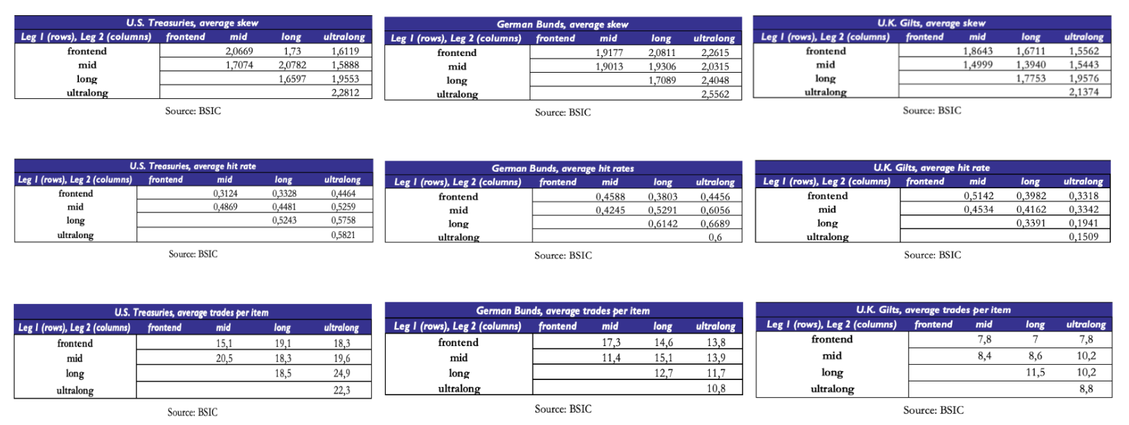 The results on curve trades in U.K. Gilts are less interpretable because of the relatively small average number of trades per item, so we struggle to comment more than we did on outrights.
The statistics on fly trades are relatively more encouraging. Once again, a small average number of trades per item prevents us from being too optimistic, but we see that certain buckets of fly trades exhibited interesting performance. For example, butterfly trades combining points of the curve in the buckets (mid, mid, ultra-long) and (mid, mid, mid) of the U.S. Treasury curve have been relatively successful in that they had relatively high skew with a hit rate of roughly 50%.
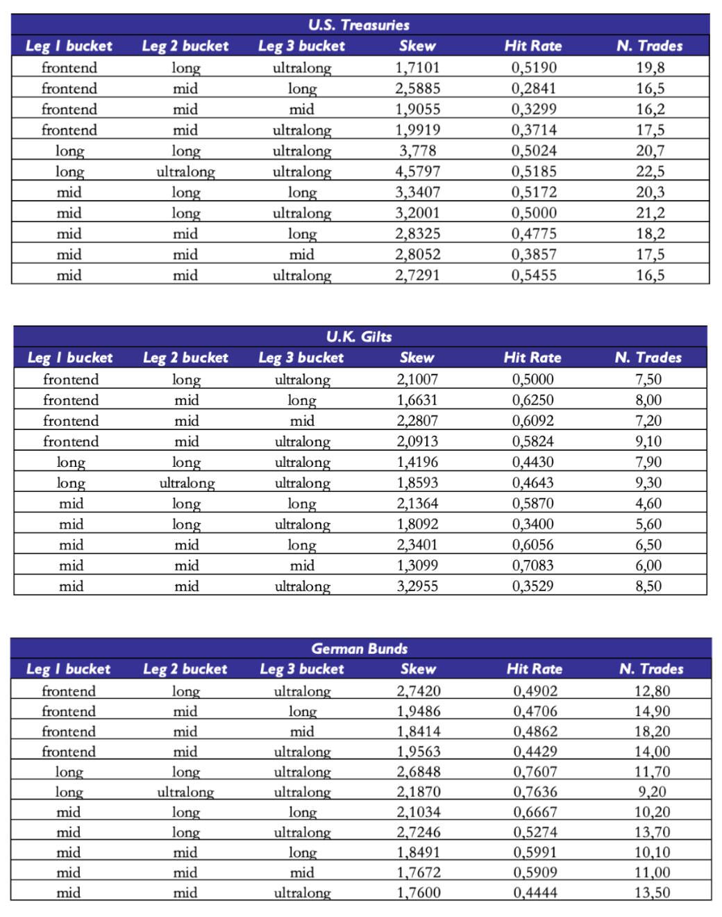 For other buckets we would be more cautious in the interpretation, since some of these buckets only group together small amounts of individual items. Since we’re only considering symmetrical butterfly trades with a minimum spacing of at least 4 years between the legs, some of these buckets only include a small number of flies. For example, while the (mid, mid, ultra-long) bucket of U.S. Treasury butterfly trades includes 36 different butterflies, the (long, ultra-long, ultra-long) bucket only includes 6 traded butterflies.
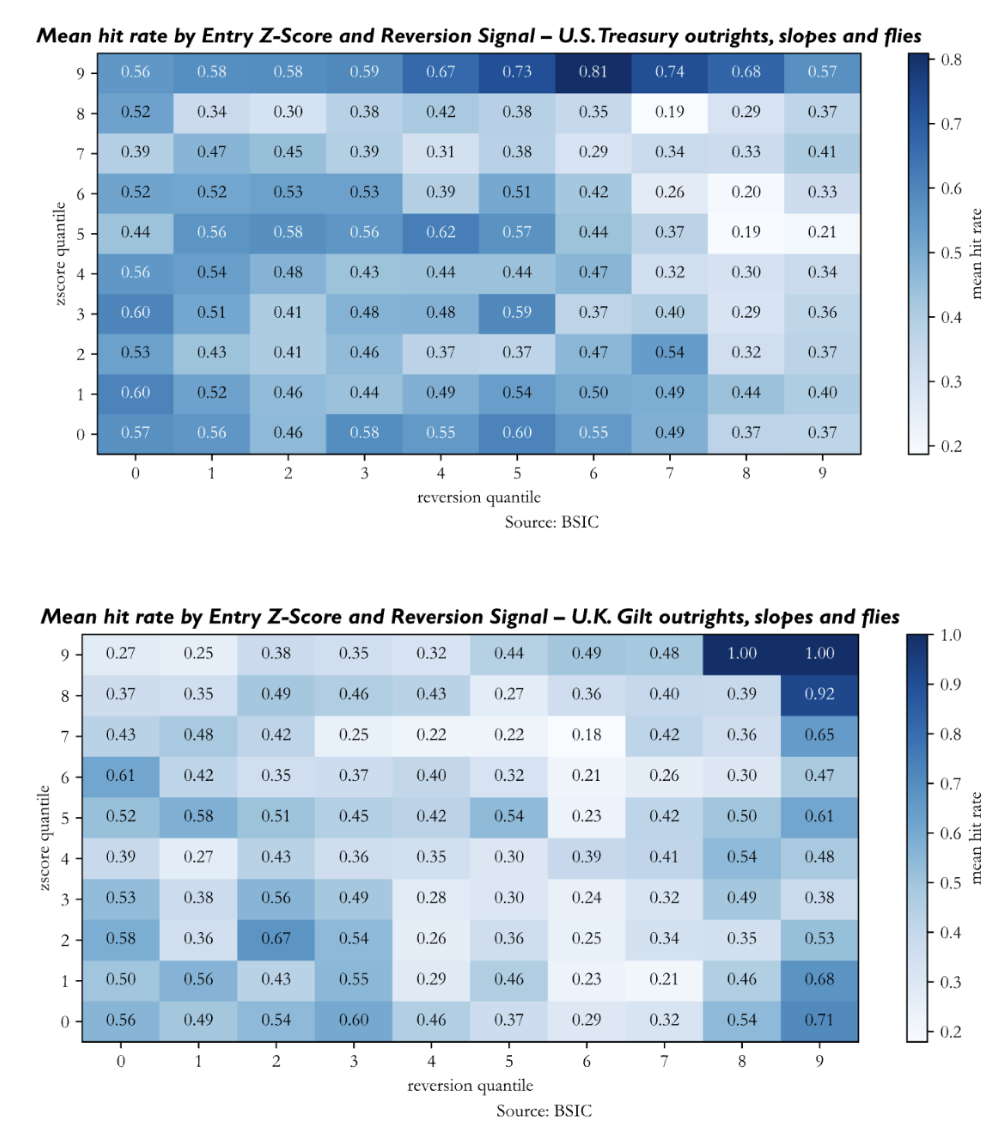
We also performed an analysis of robustness of the generated signal to understand if stronger signals (both in terms of Z-Score at entry and reversion indicator at entry) lead to better performance of trades. We group all trades in the out-of-sample window by their Z-Score and reversion signal at entry (in absolute value) into ten quantiles, and we report the mean hit rate in each of the 100 buckets of trades. The evidence isn’t as compelling as we’d like it to be. Ideally, we would want to see higher hit rates for positions opened when Z-Scores and reversion indicators were relatively large. This does not seem to be the case nor for the backtests on U.S. Treasuries, nor for those on U.K. Gilts, and neither for those on Bunds – excluding a few cells of the heatmap. Perhaps the heatmap of signal strength on the Bund term structure is the one that could persuade us relatively more, because cells in the NE quadrant show relatively higher values; but again, the picture is relatively bleak.
Conclusions
This article was aimed at presenting the model, explaining the calibration logic, and examining the results when applied to real data. The last task proved to be more challenging than expected, but due to a number of reasons that are easily visible.
The first question we could ask is whether the setup we presented is indicative of how the model would be used in a live setup, and the answer is clearly no. The first issue regards the input data: we should first define a filtering scheme to select benchmark bonds for each maturity and then perform a bootstrap of our own. This also includes the selection of an interpolation method for non-benchmark yields. Once this is done, in a bond context, one may calibrate the model and obtain a model-implied curve, which could be then used to price benchmark bonds and compute their spread relative to the model curve. These spreads could then be used as relative value indicators.
Another large question concerns whether the model shall be used as a systematic criterion or as an aid to support RV views that one has ex-ante. In the former case, then one should hope for residuals to show the least correlation structure possible. In the latter case, instead, one can accept the presence of significant structure in the correlation of the residuals but must be aware of the portfolio risk implications of adding trades that have a very strong correlation to the existing positions.
Given the empirical evidence in the related literature, it seems that the matter of specifying a form for the risk premium is not something that can be avoided with the simple assumption of a constant risk premium. As this is one of the aspects underlying the calibration procedure we used, this is probably a crucial aspect to be revisited.
Last but not least, more evidence on signal strength is needed to support the idea that the signal is worth trading; the evidence presented here does not exhibit the positive correlation between signal strength and performance that we’d expect – or perhaps measuring the hit rate alone isn’t enough, and a returns-based backtest that one could obtain with a fully specified set of bonds as we mentioned earlier could provide more insights. We leave all of these considerations here to aid future developments on similar articles.
Appendix – Additional Plots
Click here for Extended Appendix
References
- Tuckman, B., Serrat, A., “Fixed Income Securities: Tools for Today’s Markets”, 4th Edition (2022)
- Rebonato, R. (2016). Structural affine models for yield curve modelling. In P. Veronesi (Ed.), Handbook of Fixed-Income Securities. Wiley. https://doi.org/10.1002/9781118709207.ch12
- Dai, Q. and Singleton, K.J. (2000) ‘Specification analysis of affine term structure models’, Journal of Finance, 55(5), pp. 1943–1978. https://doi.org/10.1111/0022-1082.00278
- Duffee, G.R. (2002) ‘Term premia and interest rate forecasts in affine models’, Journal of Finance, 57(1), pp. 405–443.
- Fama, E.F. and Bliss, R.R. (1987) ‘The information in long-maturity forward rates’, American Economic Review, 77(4), pp. 680–692.
- Fama, E.F. and French, K.R. (1989) ‘Business conditions and expected returns on stocks and bonds’, Journal of Financial Economics, 25(1), pp. 23–49.
- Fama, E.F. and French, K.R. (1993) ‘Common risk factors in the returns on stocks and bonds’, Journal of Financial Economics, 33(1), pp. 3–56.
- Cochrane, J.H. and Piazzesi, M. (2005) ‘Bond risk premia’, American Economic Review, 95(1), pp. 138–160. doi:10.1257/0002828053828581


0 Comments